Day 5 - July 4, 2022
Topics Covered
- React Native StyleSheets
- Building responsive layouts using Flexbox
- Common React Native components
React Native StyleSheets
When building web pages, we use CSS StyleSheets to describe the presentation of elements. We will
continue this trend as we work with React Native applications. By moving styles away from the
render() function, you will keep the code concise and easier to understand.
Check out the following example. We are building a new StyleSheet by passing a JavaScript object to the
StyleSheet.create() function. The stylesheet contains two styles: container
and title. To assign a style to the appropriate component, we set the style
property, for example <View style={styles.container}>.
Depending on the platform, we may need to fine-tune our styles. For example, you may need to apply
different padding to prevent components from rendering below the status bar of the device. React Native
contains a Platform interface that allows us to learn about the underlying OS. Let's take
advantage of Platform and rewrite the container style so that it renders a
different UI depending on the device used.
On android devices, we can determine the height of the status bar by reading from
StatusBar.currentHeight but this is not possible on iOS. To workaround the differences in
the platform, we use Platform.select() to add conditional styles that render different
interfaces on different devices.
Building responsive layouts using Flexbox
Before the flexbox layout model was introduced, approaches used to build layouts were hacky and prone to errors. Flexbox provides a simple and elegant way to build layouts by abstracting many of the properties that are required in order to make the layout work.
The Flexible Layout module (or flexbox) is a box model that allows a one-dimensional layout method for arranging items in rows or columns. Items grow to fill additional space or shrink to fit into smaller spaces.
The main idea is to give a container the ability to alter its items' width, height and order to best fill the available space. The flexbox layout is direction-agnostic, as opposed to regular layouts, and works very well for components of an application.
If you haven't had an opportunity to work with Flexbox, check out the Complete Guide to Flexbox. The article is a great place to start learning to build flexible layouts.
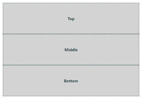
Let's implement a simple layout with three sections that flex from the top to bottom of the screen.
We use flex as a short hand for flex-grow, flex-shrink, and
flex-basis. Using this shorthand is recommended rather than setting individual properties
since it will set other values intelligently.
As you review the example, you may notice that the flexDirection is set to
column yet our output shows three rows. We use column because that is the
direction in which the items will be rendered. That is, they are contained vertically, in a column.
It is important to realize that the output will look correct regardless of the device orientation. When a device is rotated the UI will adjust appropriately.
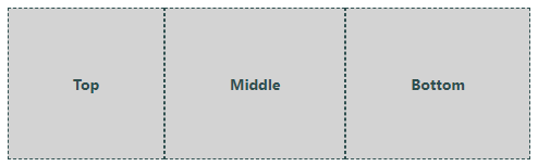
If we change the flexDirection to row instead, we get the following output.
Common React Native Components
View
This is the most fundamental component for building a UI. A View is a container that maps
directly to the native view equivalent: UIView on iOS, android.View on
Android, or <div> in a browser. Views are can be styled and can hold other views and
components.
Learn more: View
Text
A component for displaying text. Like the View component, you can style and nest a
Text component. In fact, nesting is an easy way to display formatted text rather than
annotating ranges of a string with specific formatting (like bold or colours). Inner Text
components will inherit styles (such as fontFamily) from parent components.
Unlike most other components, Text is unique relative to layout. Everything inside a
<Text> block no longer uses the Flexbox layout. Instead, it uses a text layout,
meaning that nested Text components are no longer rectangles, but wrap when they see the
end of the line.
Learn more: Text
Button
A basic button component that renders correctly on any platform. When clicked, a button will fire the
onPress event. Although the styling is not completely customizable, buttons do support
standard states such as the disabled state.
Learn more: Button
TextInput
A component for capturing text from the user. Using properties, a TextInput can be
configured to provide several features, such as auto-correction, auto-capitalization, placeholder text,
multi-line text, and different keyboard types, such as a numeric keypad or email keyboard.
When the user modifies the contents of a TextInput, the onChangeText event is
fired. Other common events include the onSubmitEditing and onFocus events.
Learn more: TextInput
Switch
Rendered as a toggle, this component provides an easy way to represent Boolean values. This is a
controlled component and therefore the programmer is resposible for updating a property to reflect
the correct state (toggled or not). By implementing a handler for the onValueChange event,
you can set the value to keep the toggle syncronized with the value.
Learn more: Switch
FlatList & SectionList
A component for rendering lists. A FlatList supports "Pull to Refresh" and "Scroll
loading". You can even group list items under headings by using a <SectionList>.
Learn More: FlatList, SectionList,
Image
Renders an image on the UI. In order to be useful, you must first provide the image data to the
component. There are two ways to load the image data, via the network (using a URI) or by providing the
data to the component. If you have the image stored as a file within your application, you can use
require() to use it as an image source.
It is worth noting that the Image component will not display unless the width and height
style properties are set. There is also a resizeMode property in case you need to scale the
image so that it fits within the dimensions of the actual component.
Learn More: Image
One more thing about images ... it is possible to use FontAwesome icons directly in your
React Native apps. Use the Icon component found in the
react-native-vector-icons package to pull in various vector font packages into your
project. You can install them by running: npm install --save @expo/vector-icons. Once
installed, include code similar to the following.
import Icon from "react-native-vector-icons/FontAwesome";
<Icon name={iconName} />